The challenge
Strategy
Impact
ITONICS Cloud inherited a patchwork of desktop components no one could reuse.
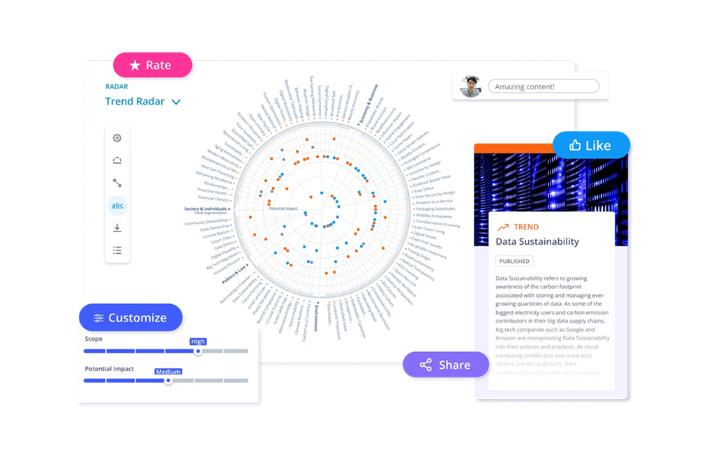
ITONICS Cloud is a SaaS solution for innovation management that helps users analyse data and translate it into insights. The Cloud had some pre-existing components inherited from the previous desktop version. We needed unified, standardised, and reusable rules to follow for the Cloud version.
The challenges
- Inconsistent & incoherentOld desktop-version components mixed with new components resulted in inconsistencies and incoherence in styles and behaviours.
- Rebuilding the same componentsDevelopers were wasting time re-coding similar components that could have been consolidated into one.
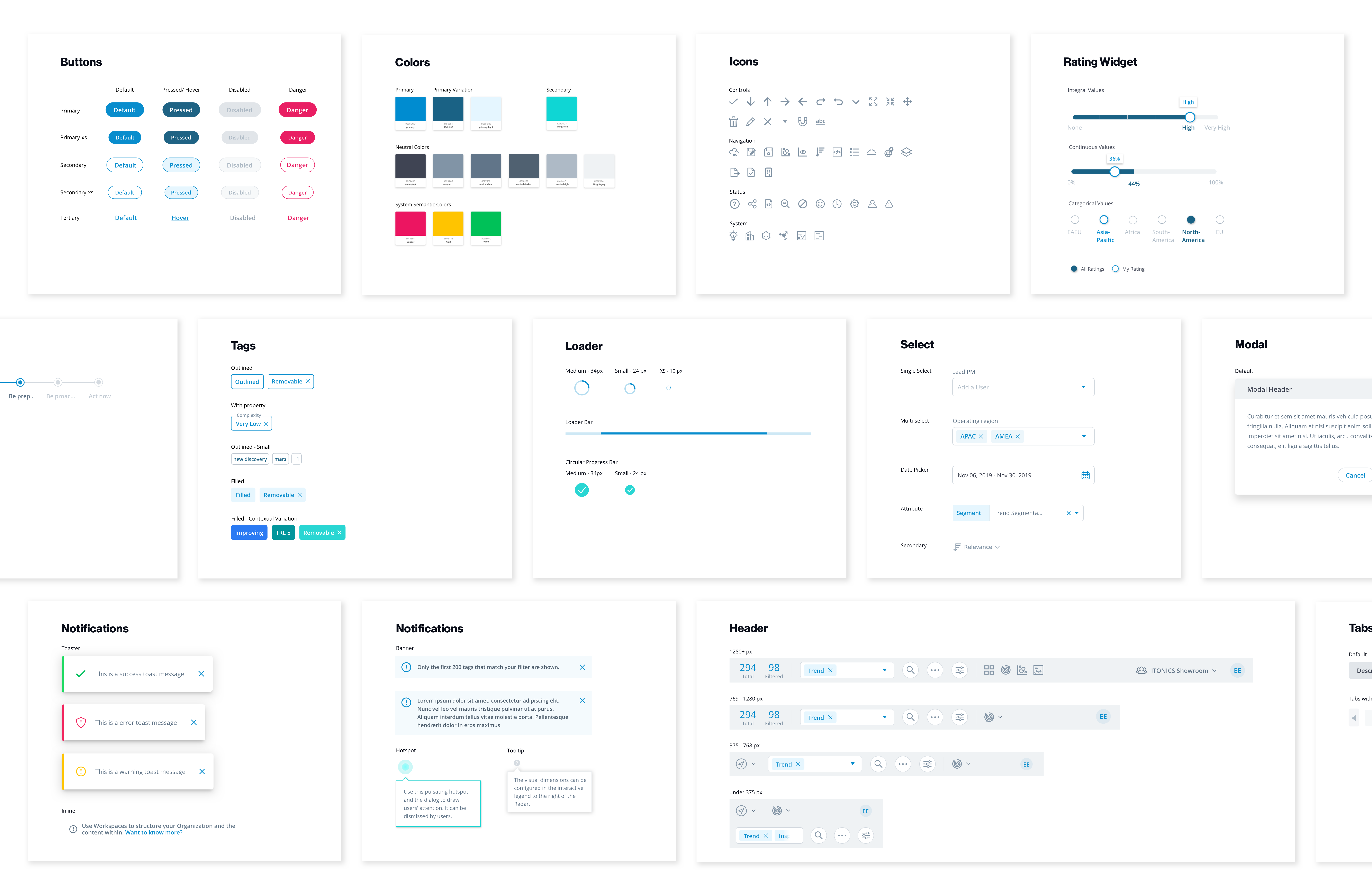
So I built one system — consistent, documented, and reusable.
What the design system should achieve
- Achieve a consistent user experience
- Provide clarity that improves communication between developers and designers
- Allow faster iteration — more frequent low-fi mockups, applying the design system once we reach a concrete design decision
How I approached it, in four steps
- Inventory audit, to evaluate the experience and identify issues
- Create a style guide; specify UX rules and component usage where none existed
- Consolidate extraneous or overlapping components and patterns
- Document and maintain the UI library
I audited the UI by purpose, not appearance — to find what actually needed standardizing.
UX auditing. The way I group elements is based on their purpose and type, rather than appearance. This aligns with how we organise the component library. Through this purpose-directed inventory, we can see an overview of how elements are used in the system, what the behaviours are, and what needs to be standardised.
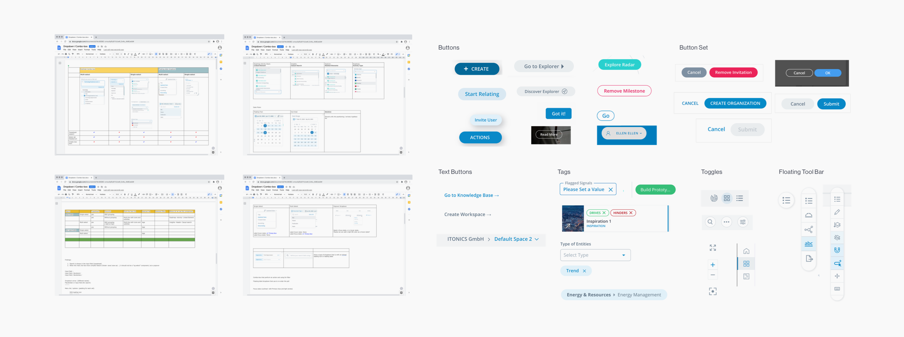
Establish rules and guidelines. After the audit, I capture the existing patterns or determine the best practices to follow as rules. I follow the Atomic Design approach (Brad Frost, 2016) to organise our design system — with folders like Atoms, Molecules, Organisms, Templates, Pages, and Extra Content.
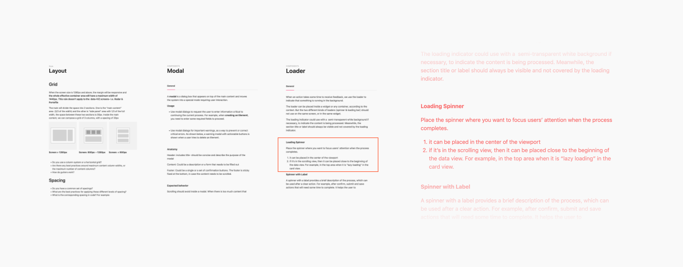
The output: a style guide, a component library, and specs the team could build from.
- Style guide and pattern library
- Design specifications
- A UI library built in Sketch to house the design files
- System maintenance and updates
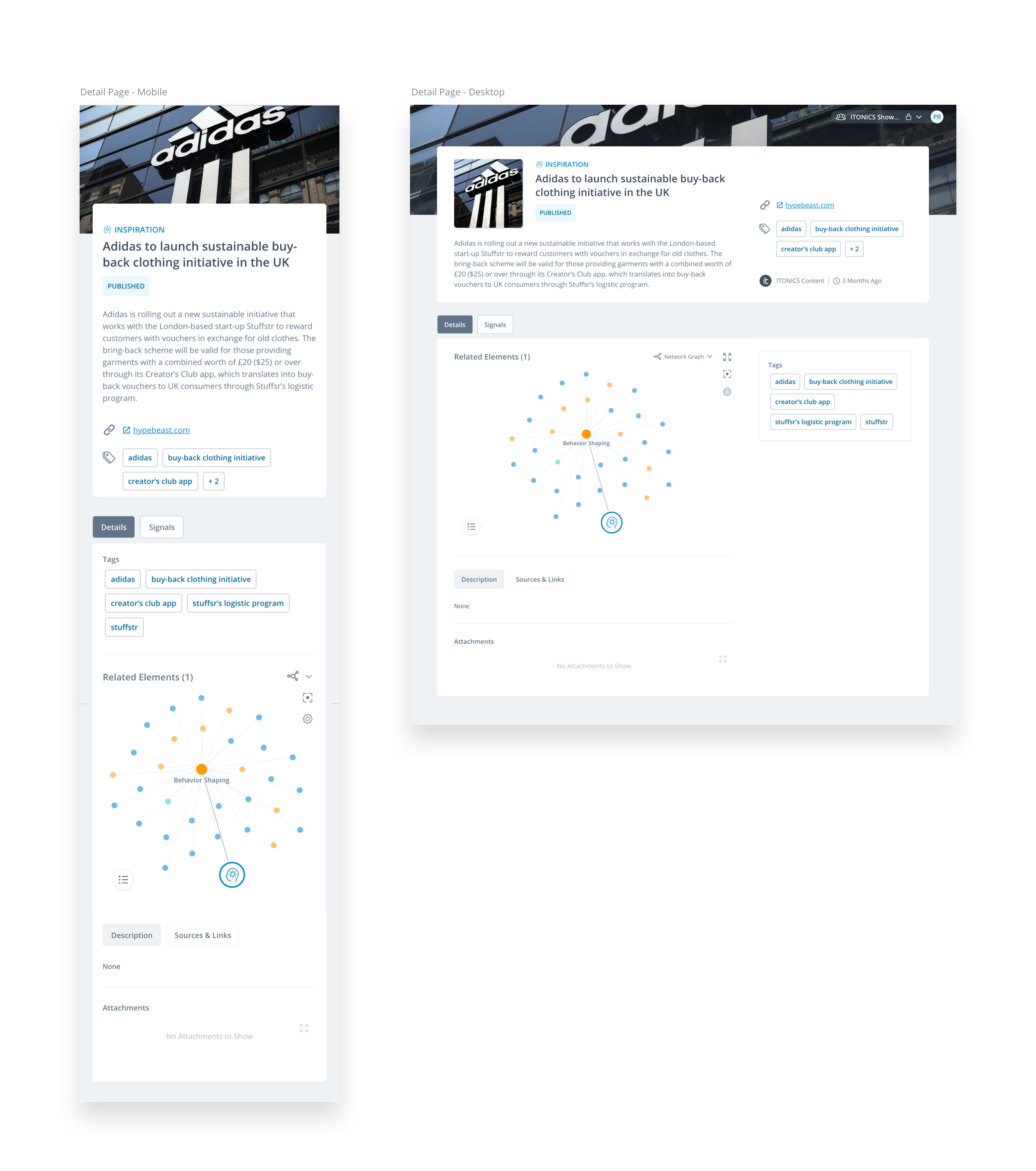
Specs & components
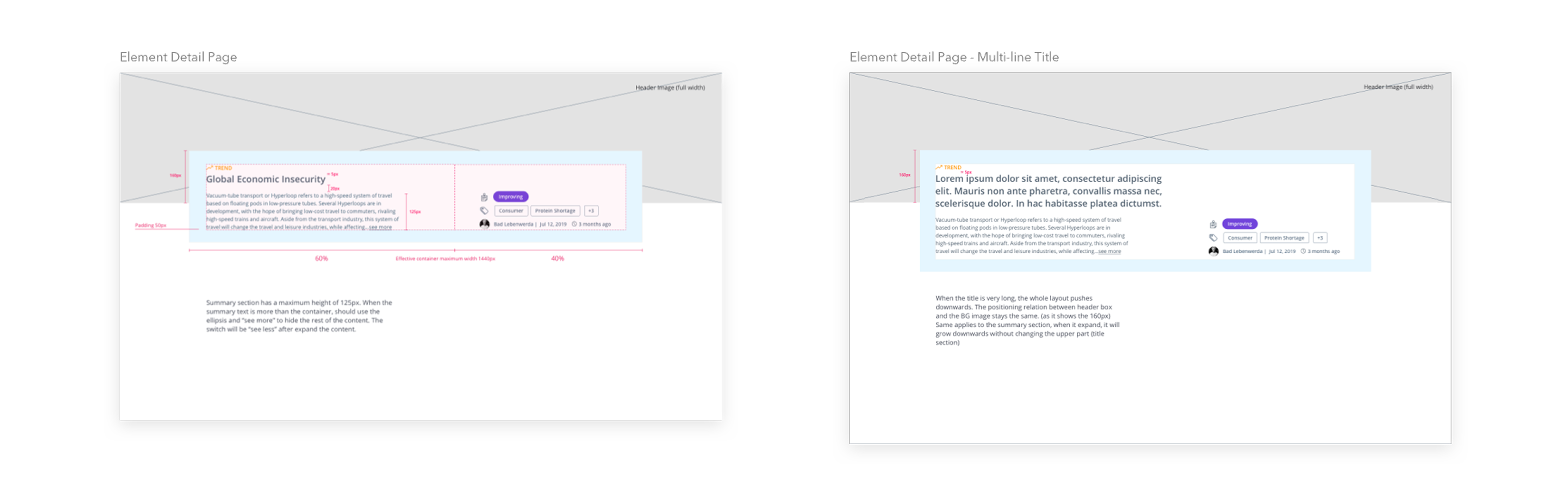
I documented each element with build-ready specs and consolidated the one-off variants into reusable components.
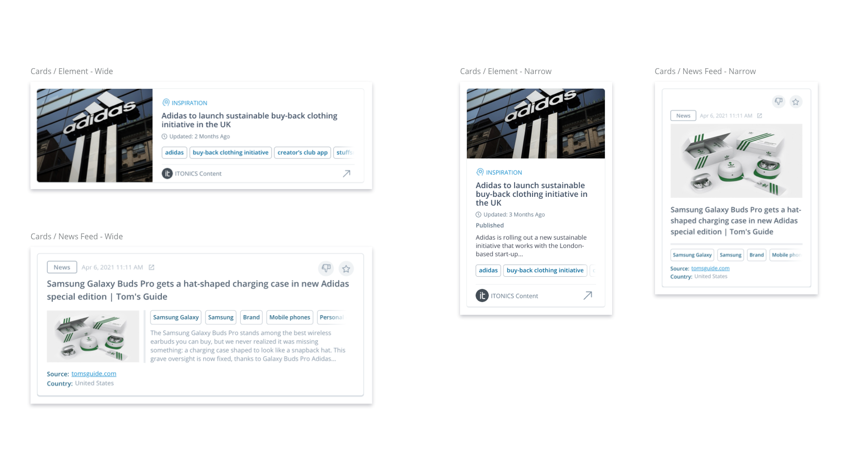
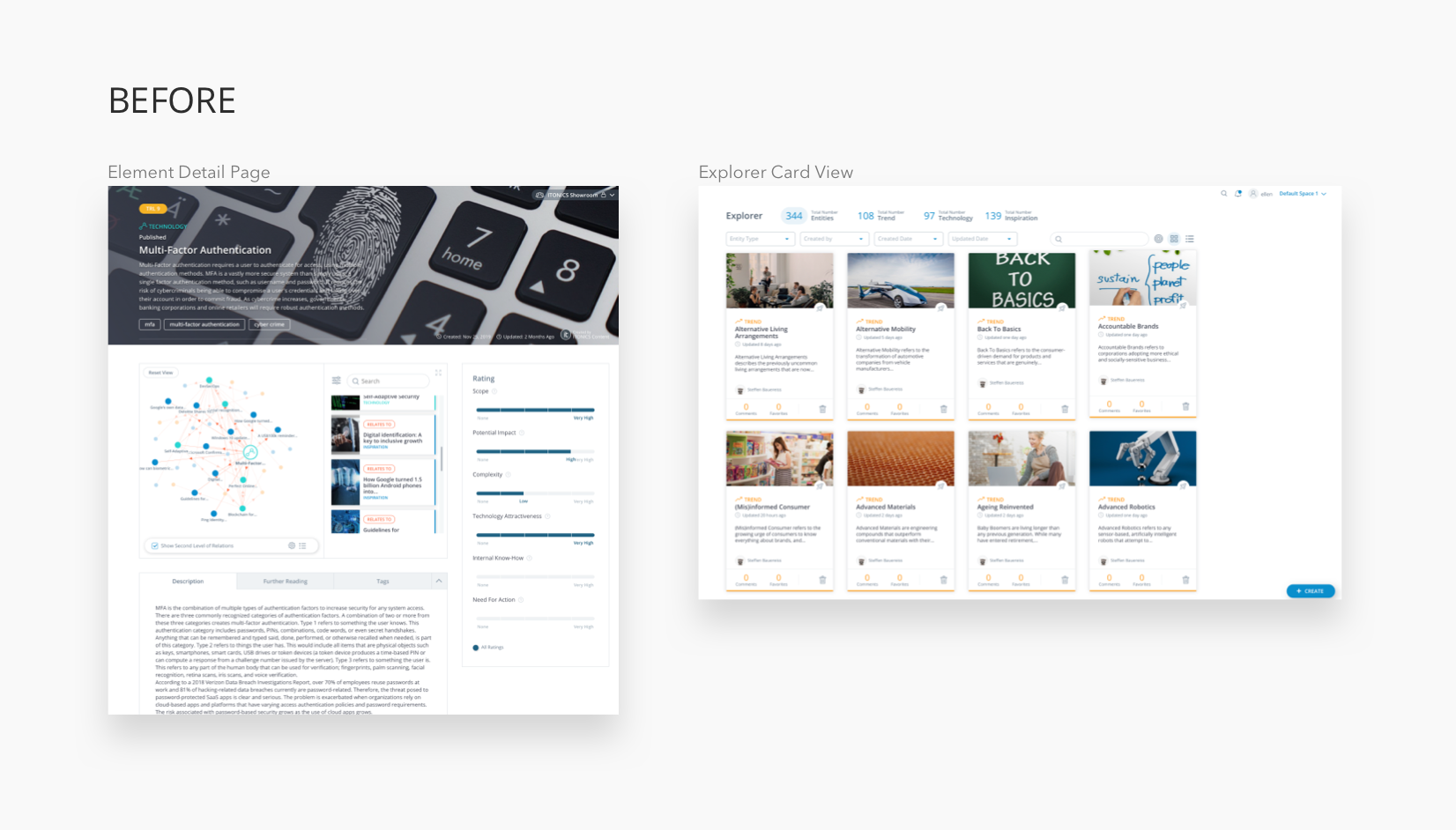
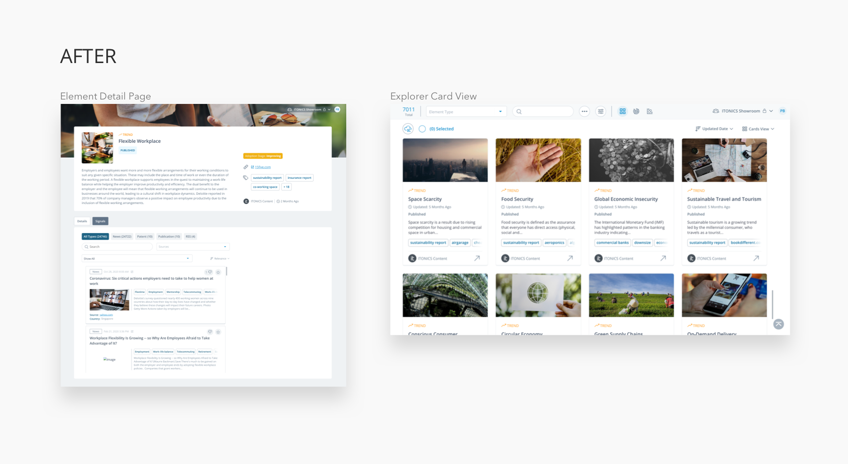
Before & after
The same interface, rebuilt on the system — consistent spacing, typography, and behaviour.
What building a design system solo taught me.
Establish rituals and processes to move things forward.Since I was the only designer on the team, I could only work on the design system in parallel with my day-to-day tasks. So I set up a roadmap and checkpoints for its development. This helped me move things forward and break the work into smaller, more manageable chunks.
Have the design system in mind. Always inspect what you can build for the design system when you have a design task. On the other hand, check what you already have in the system before making any new design.
A design system is a living, ongoing project. Sometimes the insufficiency of the guidelines shows during implementation. So updating and improving the design system is just as important as creating it.